Design Template Screen
The design template screen is where you control the look and feel of the design templates. This screen will appear when you create or add a new design template from the design template list.
Note: Required fields in each of the following tabs have an asterisk (*) next to them.
The Main tab controls the basic overall attributes of the template.
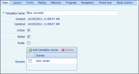
- * Template name: Type the name of the template in the text field.
- The Created and Updated fields are automatically populated.
- Select the Active check box to allow the template to be used when creating an assessment.
- Select the Global or Public check box to allow other users to use the template.
Note: If neither check box is marked, only the owner(s) will be able to view/modify the template.
- Click
 Add Question Template owner, select a name from the User drop-down list, and click Add. To remove an owner, click the check box next to it and click
  Delete.
The Layout tab offers a multitude of options to customize the look and feel of your template. It allows you to include a logo, background colors, borders, and question markers, etc.
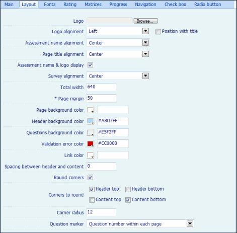
- Logo: Click Browse to locate the image file you want to use as the logo.
- Logo alignment: Select whether to align the logo to the left, right, or center of the screen from the drop-down menu.
Note: Click the Position with title check box to place the logo next to the title.
- Assessment name alignment: Select whether to align the assessment name to the left, right, or center of the screen from the drop-down menu.
- Page title alignment: Select whether to align the page title to the left, right, or center of the screen from the drop-down menu.
- Assessment name & logo display: Select this check box to display the assessment name and logo on top of the sent assessment.
- Survey alignment: Select whether to align the header and questions to the left, right, or center of the screen from the drop-down menu.
- Total width: Specify the width of the header and the question area in pixels.
- * Page margin: Specify the minimum margin between the browser frame and the assessment page.
- Page background color: Select the color of the page background using the color palette. Alternatively, type the color code in the adjacent text box (for example, #FF0000).
- Header background color: Use the color palette to select the color of the header background, or type the color code in the adjacent text box.
- Question background color: Select the color of the question background using the color palette. Alternatively, type the color code in the adjacent text box.
- Validation error color: Use the color palette to select the color for validation errors displayed to the respondents.
- Link color: Select the color for the links embedded in the assessment using the color palette, or type the color code in the text box adjacent to it.
- Spacing between header and content: Specify the space you want between the header and the content in the text box.
- Round corners: Select this check box to make the corners of the header and the question area round. If selected, it lets you choose the specific corners that you want to make round (Header top, Header bottom, Content top, and/or Content bottom).
- Drop shadow opacity: Specify the percentage of opacity of the shadow around the header and the questions.
Note: An opacity of 100% corresponds to a black shadow whereas an opacity of 0% corresponds to no shadow.
- Border width: Specify the width of the border around the question area in the text box.
- Border color: Use the color palette to select the color of the border around the question area, or type the color code in the adjacent text box.
- Border style: Select a border style from the drop-down menu.
- Extend border to header: Select the check box if you would like to extend the border to the header.
- Question marker: Select the shape for the question marker from the drop-down menu. The options include shapes and numbers.
The Font tab lets you define the style and appearance of the following fields a sent assessment.
- Assessment name: The name of the assessment.
- Page Title: The title of the page in an assessment.
- Page introduction: The text that introduces a page in an assessment.
- Page number: The page number for an assessment.
- Question text: The text of the questions in a page.
- Question subtext: The Instructions or text given below a question.
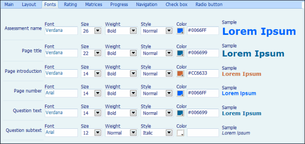
You can customize the following attributes for each of the fields listed above.
- Font: Use the drop-down menu to select the font for the text.
- Size: Select the size of the font from the drop-down menu.
- Weight: Use the drop-down menu to set the thickness of the font.
- Style: Select the style for the chosen font using the drop-down menu.
- Color: Use the color palette to select the color for the text. Alternatively, you can type the color code in the adjacent text box.
The Rating tab allows you to select a shape for the rating. In addition, it lets you customize the font and color of these shapes.
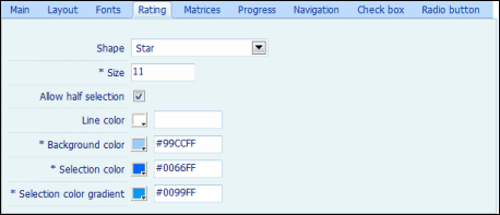
- Shape: Select the type of shape to display in the rating from the drop-down menu.
- * Size: Enter the size of shape in the text box.
- Allow half selection: Mark the check box to allow the respondents to select half portion of the shape.
- Line color: Use the color palette to select the color of the line around the perimeter of the chosen shape. You can also do so by typing the color code in the adjacent text box.
- * Background color: Select the color to use for the unselected shapes from the color palette, or type the color code in the text box adjacent to it.
- * Selection color: Select a color to use for the selected shapes from the color palette, or type the color code in the text box adjacent to it.
- * Selection color gradient: The color to use to create a gradient of color when the shape is selected. In the gradient, the selection color gradient defines the color at the top left corner of the shape. The Selection color defines the color at the bottom right corner of the shape.
The Matrices tab allows you to customize the appearance of matrices in an assessment.
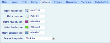
- Click the
 color palette to select the color for each of the following fields. Alternatively, you can type the color code in the text box adjacent to the color palette.
 - Matrix header color: The color of the header in a matrix.
- Matrix row color: The color of rows in a matrix.
- Matrix row alt.color: The color of each alternate row in a matrix.
- Matrix border color: The color of the border in a matrix.
- Matrix selection color: The color that appears when a field is selected.
- Segment Separator: Select either of the following options from the drop-down menu:
- Gap: Separates various segments by allowing gap between them.
- Thick line: Separates segments by thick lines.
The Progress tab lets you customize the appearance of the progress indicator in an assessment.
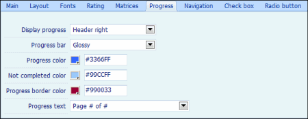
- Display progress: Select the location of the progress bar from the drop-down menu.
- Progress bar: Select if you want a flat or glossy progress bar from the drop-down menu.
- Progress color: Use the color palette to select the color for the portion of the progress bar showing the completed fraction of the assessment.
- Not completed color: Use the color palette to select the color for the portion of the progress bar showing the incomplete fraction of the assessment.
- Progress border color: Use the color palette to select the color of the border around the progress bar.
- Progress text: Select the format of the text to indicate progress from the drop-down menu.
Navigation
The Progress tab lets you customize the appearance of the progress indicator in an assessment.

- Display progress: Select the location of the progress bar from the drop-down menu.
- Progress bar: Select if you want a flat or glossy progress bar from the drop-down menu.
- Progress color: Use the color palette to select the color for the portion of the progress bar showing the completed fraction of the assessment.
- Not completed color: Use the color palette to select the color for the portion of the progress bar showing the incomplete fraction of the assessment.
- Progress border color: Use the color palette to select the color of the border around the progress bar.
- Progress text: Select the format of the text to indicate progress from the drop-down menu.
The Check Box tab contains parameters that affect the appearance of check boxes in an assessment.
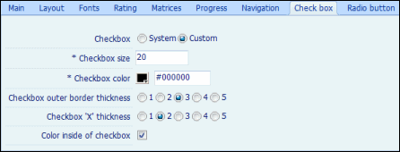
- Select either of the following radio buttons:
- System: This is the default option for displaying check boxes in an assessment and cannot be customized.
- Custom: This option allows you to customize the check boxes in an assessment.
- * Checkbox size: Specify the size of the check box in pixels.
- * Checkbox color: Select the color for the check box using the color palette.
- Checkbox outer border thickness: Select a radio button to define the thickness of the outer border of the check box.
Note: Select 1 for minimum thickness and 5 for maximum thickness.
- Checkbox 'X' thickness: Select a radio button to define the thickness of the X in the check box. 1 indicates minimum thickness, while 5 indicates maximum thickness.
Note: It's recommended that you keep the Checkbox 'X' thickness at a value lower than the thickness of the outer border.
- Color inside of checkbox: Mark the check box if you want color inside the check box.
Note: If you do not mark this check box, the color of the assessment page will show through the check box.
The Radio Button tab contains parameters that affect the appearance of radio buttons in an assessment.
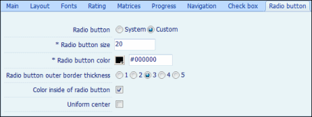
- Select either of the following radio buttons.
- System: This is the default option that displays the system-defined radio buttons in an assessment.
- Custom: This option allows you to customize the radio buttons in an assessment.
Note: The following fields will appear only if you select the Custom radio button above.
- * Radio button size: Specify the size of the radio button.
- * Radio button color: Use the color palette to select a color for the radio button.
- Radio button outer border thickness: Select a radio button to define the thickness of the outer border of radio button.
Note: 1 indicates minimum thickness and 5 indicates maximum thickness.
- Color inside of radio button: Mark the check box if you want color inside the radio button.
Note: If you do not mark this check box, the color of the assessment page will show though the radio buttons.
- Uniform center: Mark the check box if you want the center of the radio button to be uniform in color.
- (Optional) Click Preview to see how the assessment would look like once the changes you made have been saved.
- Click Cancel to undo your changes, or Save to save your changes.
|
See Also |
 Main
Main