- Access the Questions tab or the Question Template List.
- Mark the checkbox next to the page/template you wish to update. and click
 Insert question or visual element.
For page style object based assessments, you have the option of choosing between the following question types:
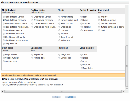
Select the basic questions or visual element type and format you wish to use. A sample version of the question you chose will appear at the bottom of the screen. When you have found the type that suits you, click OK. The type you choose will populate the question configuration screen with predefined default settings, depending on your selection..
The following fields are common to all questions:
Note: Required fields are marked with an asterisk (*)
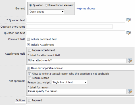
- Element: Allows you to change the question type. To do so, select whether you would like to add a question or a presentation element. Then, select a type from the drop-down list.
Note: Click Help me choose to return to the original selection screen.
- * Question text: The text used in the Assessment question.
Note: Question text must be defined for each language in the Assessment
- Question short name: The question short name is a language independent name for the question that will be used in reports. If the question short name is not defined, the name for the question for the default language for the Assessment will be used in reports.
- Question sub-text: The question sub-text displays below the question name and can be used to give assessors instructions on how to answer the question or to clarify the information provided in the question name
- Comment field: Select the Include comment field checkbox if you would like to include a comment field below your question. Then, select whether a comment is required and type the label for the comment field.
- Attachment field: Select the Include attachment field checkbox if you would like to include an attachment field below your question. Then, select whether an attachment is required and type the label for the attachment field.
- Not Applicable: Select the Allow not applicable answer checkbox if you would like to include a non applicable answer to your question.
- Click the Require reason checkbox if you want to include a text field to explain the reason. If checked, you can then specify if you want the response in a single line of text or multiple lines, and also type a label for the reason.
Note: This function is not available for Demographic and Matrix/Multimatrix question types.
- Click the Require reason checkbox if you want to include a text field to explain the reason. If checked, you can then specify if you want the response in a single line of text or multiple lines, and also type a label for the reason.
Question Types
The section below lists the different question types and the fields specific to those types:
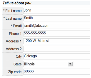
This question type is used to gather respondent information such as name, email, or address. There can be only one demographic question per assessment.
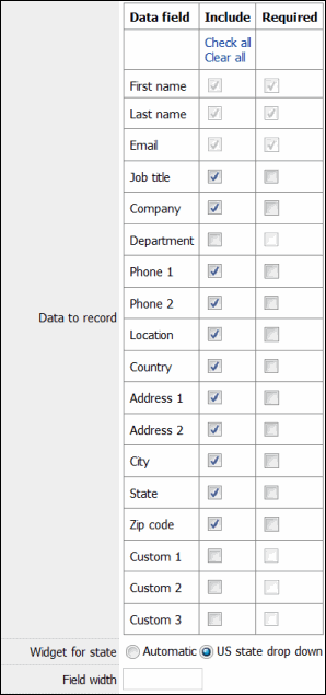
- Data to record: The first name, last name and email of respondents are always included. Select the check boxes in the Include column next to the demographic information that you would like to include. Select the check boxes in the Required column for fields you would like to be required. Click Check All to select or Clear All to de-select all of the check boxes.
- Widget for state: If the Country field is included, the state field will adjust automatically based on the value chosen for the country field If the Country field is not included, the following options are available to record the state field in the absence of the Country field:
- Automatic: The state field will be either a drop-down list of US state or Canadian provinces, or a text field depending on the localization information provided by the respondent's browser.
- US state drop down: The state field will be a drop-down list of US states
- Canadian province drop down: The state field will be a drop-down list of Canadian provinces.
- Free text: the state field will be a text field.
- Field width: Specifies the field width in pixels for all of the fields displayed in the page. If no value is specified, all fields will be sized automatically.
Below is an example of what a demographic question looks like in an assessment::
File upload questions allow participants to upload one or several files. The files are associated to the assessment response and are available from the browse screen and in the response export files.
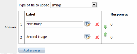
- Type of file to upload: Specifies if the file(s) to upload should be an image file or of any file type. Recognized image formats are: jpeg, png, gif, and bmp. If the type to upload is 'Image' and the participant attempts to load a file that is either not an image or an image in an unsupported format, a validation error will occur and the participant will have to change the file to upload before being able to proceed with the assessment.
- Answers: Add your answers to the questions here in the Label text field. Each answer for the question will provide the participant with the ability to upload a file.
- Click Add answer to add additional answers to the question.
- Click
 Delete next to the answer to remove it from the list.
 - User the
 Arrow Keys to change the sorting of your answers.
Below is an example of what a fie upload question looks like in an assessment::

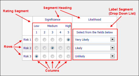
The Assessment Management Engine supports sophisticated matrix and multi-matrix questions. A matrix question is a series of questions that share the same answer choices, while multimatrix questions are a series of questions that contain multiple answers within the same matrix. Questions are represented by rows, while responses are represented by segments.
The example below shows a multimatrix question. The 3 questions you will be rating appear in rows on the left-hand side. The segments to the right enable you to provide answers. Note that you can use different answer types for each segment. In this instance, the Significance segment is a rating system while the Likelihood segment is a drop-down menu.
Matrix Rows
This section defines the rows (questions) to be used in the matrix.
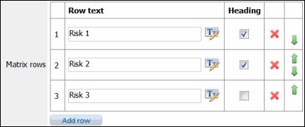
- By default, the system displays three rows. Click Add row to add additional rows or click
 Delete next to the row to remove it from the matrix.
 - Enter the row labels into the Row text field.
- Use the
 Arrow Keys to change the sort order of the rows.
 - Select the Heading check box if you would like to use one of the rows as a heading.
Matrix Segments
This section specifies the segments used to respond to the questions in the rows. By default, there is only one segment to begin with. You can add additional segments by clicking Add segment or click ![]() Delete to remove the segment from the matrix. You can also use the
Delete to remove the segment from the matrix. You can also use the ![]() Arrow Keys to change the position of the segments.
Arrow Keys to change the position of the segments.
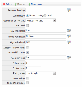
Numeric Rating Segment:
|
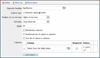
Label Segment:
|
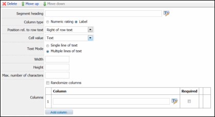
Label Segment:
|
- Segment heading: Type the text to appear in the segment header.
- Position Relative to row text: Select whether the segment will be displayed to the right or left of the row text in the matrix.
- Column type: Select the type of segment you wish to use in your column and fill out the fields specific to each segment type.
Numeric rating: Provides an answer using a numeric rating system. Fill out the following fields:
- Required: Select this check box if you want the rating for each row in the matrix to be required.
- Low value label: Type the label for the low rating value in the range of segment, if applicable.
- Middle value label: Type the label for the middle rating value in the range of segment, if applicable.
- High value label: Type the label for the high rating value in the range of segment, if applicable.
- Adaptive column width: If this check box is selected, the width of the columns will be adjusted based on the widths of the Low and High value labels, If the option is not set, the column width will not be adjusted, resulting in a generally more compact matrix.
- Include NA option: Select this check box if you would like a Not Applicable ("NA") option in the ranking.
- NA option text: The column header for the NA option. This field is available only when the Include NA option check box is selected.
- * Low value: The integer value corresponding to the lowest possible rank.
- * High value: The integer value corresponding to the highest possible rank.
- Rating Scale: Choose whether the rating should rate from highest number to lowest or vice-versa.
- Invert rating: Allows you to invert ratings for the segment.
- Each Rating Unique: Select this check box if you want each row in the matrix to have a rating distinct from any other row. Note that this option should be selected only when there are at least as many rating available as there are rows in the matrix.
Label: Provides an answer by filling out a field. You can change the field types (Text, Drop-down, etc.) and add multiple fields as columns. Fill out the following fields:
- Required: Mark this check box if you want a rating for each row in the matrix to be required. This option is available only for label segments with a Radio button or Number cell value. For Text box label segments, the required option will be available for each column in the segment. For Checkbox label segments, use the "Min. number of answers" field to make the segment required. See more on the different type of cell values below.
- Cell value: The field type that will be used for the response values. The following values are available:
- Radio button: Restricts the assessor's selection to a single value.
- Check box: Allows selection of any number of values.
- Text box: Allows a free text answer for each column.
- Number: Allows a numeric answer for each column.
- Drop down list: Enables a list of choices in a drop-down list in each cell for the segment. A list of values can be defined for each column in the matrix segment and will be presented to assessors in a separate drop-down list.
- Minimum: Sets the minimum number for a Number cell value.
- Maximum: Sets the maximum number for a Number cell value.
- Row sum: Sets the required sum of the values for each row for a Number cell value.
- Text Mode: Allows the users to choose from either of the following text mode options:
- Single line of text: Select this radio button if you want to type in a piece of text that would accommodate itself in a single line of text box. This text mode is generally used to enter the data having less amount of text. You can set only the Width property for the text box, if you select this text mode.
- Multiple lines of text: Select this radio button if your text has a lot of information and would not accommodate in a single line of text box. This radio button is selected to increase the readability of a piece of text. You can set both Width and Height property for the text box, if you select this text mode.
- Width: Sets the width in pixels of the widget in each cell of the matrix segment. This parameter is available for cell values 'Number', 'Text', and 'Drop down list'.
- Height: Sets the height of the text fields of the matrix segment. This parameter is available only for the Text cell value and gets activated only when the Multiple lines of text text mode is selected.
- Min. number of answers: Sets the minimum number of answers that must be selected for each row in a Check box cell value.
- Max. number of answers: Sets the maximum number of answers that can be selected for each row in a Check box cell value.
- Required: Specifies if an answer is required for a given column in a Text box or Number cell value.
- Randomize columns: Mark this check box to make the order of the columns in the segment random when the question is presented to the assessor. By default, the columns are shown to respondents in the order in which appear in the columns table.
- Randomize list of values in columns: Mark this check box to randomize the values in the drop-down for each column. Note that all drop-down lists in a given column will show the values in the same order.
- Sort list of values in columns: Mark this check box to sort the values in the drop-down in each column in ascending alphabetical order.
- Columns: Enter header text for each column in the segment. One value must be defined for each column.
Multiple choice questions allow assessors to select from a choice of predefined answers.
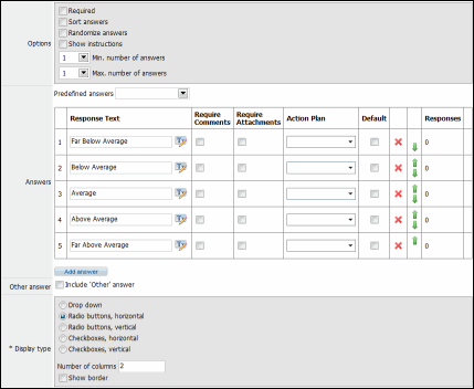
- Options: Select the checkbox to enable the following options:
- Required: Specifies if a response is required for the question. Assessors will not be able to move to the next page in the assessment until they answer to the question.
- Sort answers: If checked, the answers will be sorted in alphabetical order.
Note: This option and the Randomize Answers option (below) are mutually exclusive and cannot be selected at the same time.
- Randomize answers: If checked, the answers will be sorted randomly.
Note: If neither the Sort Answers or Randomize Answers options are selected, the answers will be shown in the order they appear in the answer table.
- Predefined Answers: You have the option of selecting common sets of predefined choices from the drop-down list. When a value is selected, the corresponding choices are populated in the Answers table (see below).
- Answers: The answers table defines how the answers will appear in the assessment. The answers are listed in order by rows.
- Click Add answer to add a new answer to the question.
- User the
 Arrow Keys to change the sorting of your answers.
 - Click
 Delete next to the response to remove it from the list.
 - Response Text: Allows you modify the answer text as they would appear in the assessment.
- Require Comments: Mark this checkbox if you would like to require a comment after the assessor's response to the question.
- Require Attachment: Mark this checkbox if you would like to require an attachment after the assessor's response to the question.
- Action Plan: Select an action plan from the list of action plan templates. If the response is chosen when completing the assessment, an action plan is sent to the user(s) in the Action Plan Reviewer role.
Note: The Action Plan Reviewer role is determined in the Assessment tab of the Assessment Setup screen.
- Include 'Other' answer: Mark this checkbox if you would like to have "Other" as an additional answer.
- Label for 'Other' answer: Change the "Other" answer text, if applicable
- Show free text entry widget: Mark this checkbox if you would like to include a text field to display if the user selects "Other" as an answer. Select whether you would like a single line or multiple lines of text or if you would like to require a text answer.
- Display Type: Select the following radio button to determine how the answers will be displayed on the assessment.
- Drop down: Displays the answers in a drop down list.
- Radio buttons, horizontal: Displays the answers as radio buttons in a horizontal direction.
- Radio buttons, vertical: Displays the answers as radio buttons in a vertical direction.
- Checkboxes, horizontal: Displays the answers as checkboxes in a horizontal direction.
- Checkboxes, vertical: Displays the answers as checkboxes in a vertical direction.
- Number of Columns: Defines how many columns will be used to display the answer choices
- Show Border: Mark this checkbox if you would like to add a border.
Below is an example of what a multiple choice question would look to the assessor:

Open ended questions allow the assessor to answer the question free form by typing in text, a number, or a date, depending on the option selected.
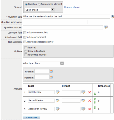
- Options: Select the check box to enable the following options:
- Required: Specifies if a response is required for the question. Assessors will not be able to move to the next page in the assessment until they answer to the question.
- Sort answers: If checked, the answers will be sorted in alphabetical order.
Note: This option and the Randomize Answers option (below) are mutually exclusive and cannot be selected at the same time.
- Randomize answers: If checked, the answers will be sorted randomly.
- Value Type: Select from the following field type from the drop-down menu:
- Text: Allows for free form text entry.
- Select the radio button to determine whether you would like a Single line of text or Multiple lines of text.
- Type in a number for the Maximum number of characters used in the text field
- Type in a number for the Width of the field in pixels.
- Mark the Email check box to specify if the value entered by the assessor should be an email address. This field is only available when Text box is set to Single line of text.
- Date: The assessor is required to type in a date as the answer. Add a date range by entering dates in the Minimum and Maximum fields, if applicable.
- Number: The assessor is required to type in a number as the answer. Add the Minimum and Maximum numbers allowed, if necessary.
- Text: Allows for free form text entry.
- Answers: The answers table defines how the answers will appear in the assessment. The answers are listed in order by rows.
- Click Add answer to add a new answer to the question.
- User the
 Arrow Keys to change the sorting of your answers.
 - Click
 Delete next to the response to remove it from the list.
 - Enter a Label or a Default Value for the field for each answer.
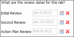
Below is an example of how an open ended question would appear to the assessor:
Rating questions allow respondents to assign a numeric value to items either through selection of a shape (e.g., a star) or by entering the value directly. Each answer you provide can be ranked or rated individually by the assessor.
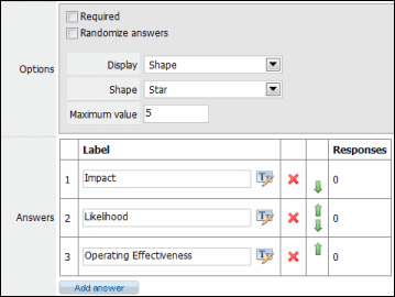
- Options: Select the checkbox to enable the following options:
- Required: Specifies if a response is required for the question. Assessors will not be able to move to the next page in the assessment until they answer to the question.
- Randomize answers: If checked, the answers will be sorted randomly.
- Display: Choose whether you would like a Shape or a text box.
- If you chose Shape, choose the type of shape you would like to use
- If you chose Text box Left or Right, mark the text box to allow for ties or include instructions.
- Enter the Maximum value the user can select in the rating answer.
- Answers: The answers table defines how the answers will appear in the assessment. The answers are listed in order by rows.
- Click Add answer to add a new answer to the question.
- User the
 Arrow Keys to change the sorting of your answers.
 - Click
 Delete next to the response to remove it from the list.
 - Label: Enter the Label text for the field.
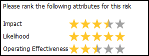
Below is an example of what a rating type question would appear to the assessor:
Visual Element Types
Presentation elements are used to customize the appearance of pages or display information not readily included in questions. The following visual elements are available:
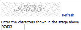
A captcha presentation element provides a means to ensure that the assessor is human and not automated by a computer. Even though a captcha requires an input from the user, no actual data is recorded in the database, not in the assessment results.
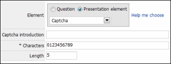
- Captcha introduction: Enter the introductory text shown before the captcha image.
- Characters: Type in the characters to use when the captcha is generated. By default, the characters are digits 0 through 9.
- Length: Specify the number of characters in the capcha.
Below is an example of what a capcha presentation element looks like in an assessment:
The HTML presentation element allows you to include HTML in an assessment page. Enter the HTML in the text field.
Note: The HTML cannot include script elements.
Allows you to insert an image into the assessment page.
![]()
- Image: Click Browse..., locate the image you wish to include and click OK.
- Alignment: Choose from the drop-down list whether you would like the image centered, left or right aligned.
Inserts a horizontal divider in an assessment page.
- Width: Specify the width of the divider as a percentage of the total width for the assessment page (e.g., Width = 50% creates a divider that is half of the page width).
- Height: Specify the height l for the divider in pixels.
- Color: Click on the color palette to elect the color for the divider.
The text presentation element allows you to insert text in an assessment page. Add the text you wish to include in the page and select from the drop-down list whether you would like it center, left or right aligned.
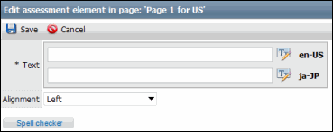
- Click the Styling of text button to format the text style.
- The text style dialog box allows you to apply various formatting options to your text. Format your text using the available formatting options.
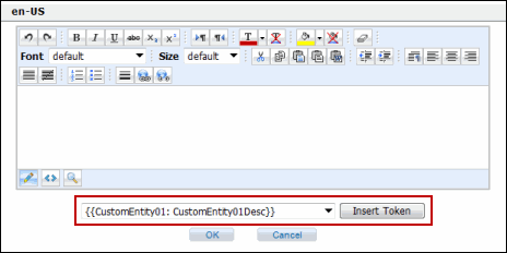
- Tokens: Tokens allow Governance Portal data to be automatically inserted into the question when the assessment is deployed. The tokens available are based on the question type selected.
- Select the token you wish to insert in your text from the Token drop-down list.
- Click Insert Token.
- Click OK.
Click ![]() Save when finished.
Save when finished.
The Single Evaluation Type option allows you to choose a field in the Governance Portal that is updated according to the assessor's response to the question.

- Select the field you wish to include from the drop-down menu. The choice of fields in the menu is dependent on the object you chose when you created the assessment. For instance, if you chose Risk as the object, only the fields in the Risk form within the Governance Portal would appear. Depending on the type of field you choose (e.g. memo, category, boolean), a sample of your field type will appear at the bottom of the screen. In the example below, we have chosen the Inherent Risk Rating field, which is a category field on the Risk form.
Note: In order for a field to appear on this list, it has to be configured to display on the RCM Core Search. For more information, see Configure Search Settings.
- Click OK. You will be directed to the configuration screen, where you will configure your question in more detail.
- The configuration screen allows you to customize the presentation and behavior of your question. The options will change depending on the type of field you choose when adding the question to the assessment.
The following fields are common to all selected field types:
Note: Required fields are marked with an asterisk (*)
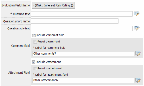
- Evaluation Field Name: The name of the field used in the evaluated question.
- * Question text: The text used in the Assessment question.
Note: Question text must be defined for each language in the Assessment
- Question short name: The question short name is a language independent name for the question that will be used in reports. If the question short name is not defined, the name for the question for the default language for the Assessment will be used in reports.
- Question sub-text: The question sub-text displays below the question name and can be used to give assessors instructions on how to answer the question or to clarify the information provided in the question name
- Comment field: Select the Include comment field checkbox to include a comment field below your question. Then, select whether a comment is required and type the label for the comment field.
- Attachment field: Select the Include attachment field checkbox to include an attachment field below your question. Then, select whether an attachment is required and type the label for the attachment field.
Field Types
The configuration options will differ according to the type of field you selected for your evaluation question. Below lists all the field types and their associated options.
Memo fields allow you to input any combination of text or numbers.
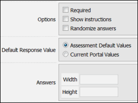
- Options: Select the check box to enable the following options:
- Required: Specifies if a response is required for the question. Assessors will not be able to move to the next page in the assessment until they answer to the question.
- Randomize answers: Not applicable for evaluation questions.
- Show instructions: Not applicable for evaluation questions.
- Default Response value: Choose Current Portal Values if you would like to use the default field value specified in the Governance Portal, or choose Assessment Default Values if you do not want a default value to be specified.
- Answers: This section defines the appearance and size of the answer response.
- Width/Height: Enter a number the width and height of the text field in pixels.
This field is comprised of a list of values that a user will select from when completing information in the Governance Portal.
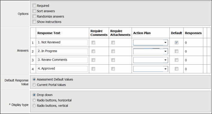
- Options: Select the check box to enable the following options:
- Required: Specifies if a response is required for the question. Assessors will not be able to move to the next page in the assessment until they answer to the question.
- Sort answers: If checked, the answers will be sorted in alphabetical order.
Note: This option and the Randomize Answers option (below) are mutually exclusive and cannot be selected at the same time.
- Randomize answers: Not applicable for evaluation questions.
- Show instructions: Not applicable for evaluation questions.
- Answers: The answers table defines how the categories will appear in the assessment. The answers are listed in order by rows.
- Response Text: Allows you modify the category text as they appear in the assessment.
- Require Comments: Mark this check box to require a comment after the assessor's response to the question.
- Require Attachment: Mark this check box to require an attachment after the assessor's response to the question.
- Action Plan: Select an action plan from the list of action plan templates. If the response is chosen when completing the assessment, an action plan is sent to the user(s) in the Action Plan Reviewer role.
Note: The Action Plan Reviewer role is determined in the Assessment tab of the Assessment Setup screen.
- Default: Mark this check box to make this answer the default for the question.
- Responses: Shows the number of responses for an answer.
- Click
 Delete next to the response to remove it from the list.
- Default Response Value: Choose Assessment Default Response Values to use the default selected in the assessment, or Current Portal Values to use the default selection specified for the field in the Governance Portal.
- Display Type: Select the following radio button to determine how the answers/categories will be displayed on the assessment.
- Drop down: Displays the categories in a drop down list.
- Radio buttons, horizontal: Displays the categories as radio buttons in a horizontal direction. Select the number of columns and mark the check box if you would like to add a border.
- Radio buttons, vertical: Displays the categories as radio buttons in a vertical direction. Select the number of rows and mark the check box if you would like to add a border.
Boolean fields display a simple yes/no or true/false values, and is displayed as a checkbox in the Governance Portal.
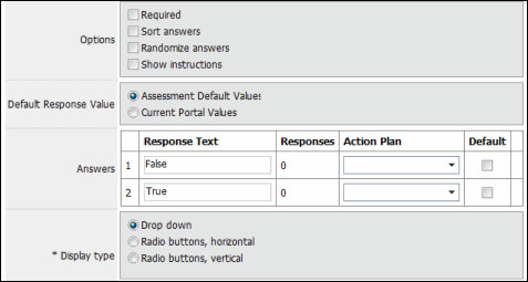
- Options: Select the checkbox to enable the following options:
- Required: Specifies if a response is required for the question. Assessors will not be able to move to the next page in the assessment until they answer to the question.
- Sort answers: If checked, the answers will be sorted in alphabetical order.
Note: This option and the Randomize Answers option (below) are mutually exclusive and cannot be selected at the same time.
- Randomize answers: Not applicable for evaluation questions.
- Show instructions: Not applicable for evaluation questions.
- Answers: The answers table defines how the categories will appear in the assessment. The answers are listed in order by rows.
- Response Text: Allows you modify the response text as they appear on the assessment (True/False, Yes/No, etc.)
- Action Plan: Select an action plan from the list of action plan templates. If the response is chosen when completing the assessment, an action plan is sent to the user(s) in the Action Plan Reviewer role.
- Default Response Value: Choose Assessment Default Response Values to use the default field value selected in the assessment, or Current Portal Values to use the default selection specified in the Governance Portal.
- Display Type: Select the following radio button to determine how the answers/categories will be displayed on the assessment.
- Drop down: Displays the categories in a drop down list.
- Radio buttons, horizontal: Displays the categories as radio buttons in a horizontal direction. Select the number of columns and mark the checkbox if you would like to add a border.
- Radio buttons, vertical: Displays the categories as radio buttons in a vertical direction. Select the number of rows and mark the checkbox if you would like to add a border.
This field value is represented by a specific date
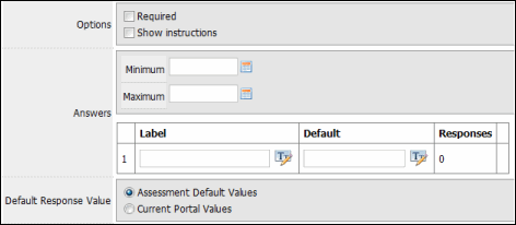
- Options: Select the checkbox to enable the following options:
- Required: Specifies if a response is required for the question. Assessors will not be able to move to the next page in the assessment until they answer to the question.
- Show instructions: Not applicable for evaluation questions.
- Answers: The answers section defines how the date field will appear for the answers in the assessment.
- Maximum/Minimum: Set a date range for the responses by entering the latest and earliest dates in the Maximum and Minimum fields, respectively.
- Label: Enter a label for the date used in the response.
- Default: Enter a default date for the response, if applicable.
- Default Response value: Choose Current Portal Values if you would like to use the default field value specified in the Governance Portal, or choose Assessment Default Values if you do not want a default value to be specified.
This field allows the user to respond with a number only and can include decimals. No text is allowed in the response.

- Options: Select the checkbox to enable the following options:
- Required: Specifies if a response is required for the question. Assessors will not be able to move to the next page in the assessment until they answer to the question.
- Show instructions: Not applicable for evaluation questions.
- Answers: The answers section defines how the field will appear for the answers in the assessment.
- Maximum/Minimum: Set a number range for the responses by entering the highest and lowest numbers in the Maximum and Minimum fields, respectively.
- Label: Enter a label for the number used in the response.
- Default: Enter a default date for the response, if applicable.
- Default Response value: Choose Current Portal Values if you would like to use the default field value specified in the Governance Portal, or choose Assessment Default Values if you do not want a default value to be specified.
When you have completed entering the data into the fields, click Spell Checker to run a spell check, Save to save the changes, or Cancel to cancel without saving.
|
See Also Add a Question - Object Based Assessment |
 Standard Question Types